VR Simulation UI + UX
ui/ux designer.
project summary.
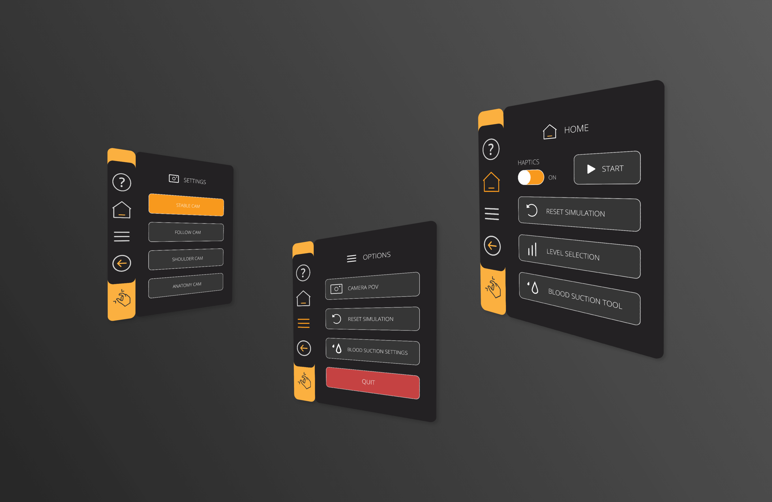
I designed the VR interface and experience for a series of medical procedure simulations that were requested by a client last minute.
deliverables.
Icons
Prototype
User Flow
Unity Ready Assets
Design System
tools.
Adobe XD, Adobe Illustrator
background.
ImmersiveTouch is a software development company building VR technology to help surgeons plan complex surgeries with real patient data.
ImmersiveTouch has also created a handful of VR simulations that require a haptic device. These are used mostly for training purposes.
This haptic device simulation project was requested last minute with a deadline of ASAP. We were in the middle of releasing one product and another product in the research phase. ImmersiveTouch only has 2 designers total, I’m one of them, so everyone was busy.
I worked with the head developer in India to bring this product to completion. The simulation was already built other than the UI.
Completed 3 simulations in 2 weeks.
2021
the starting point.
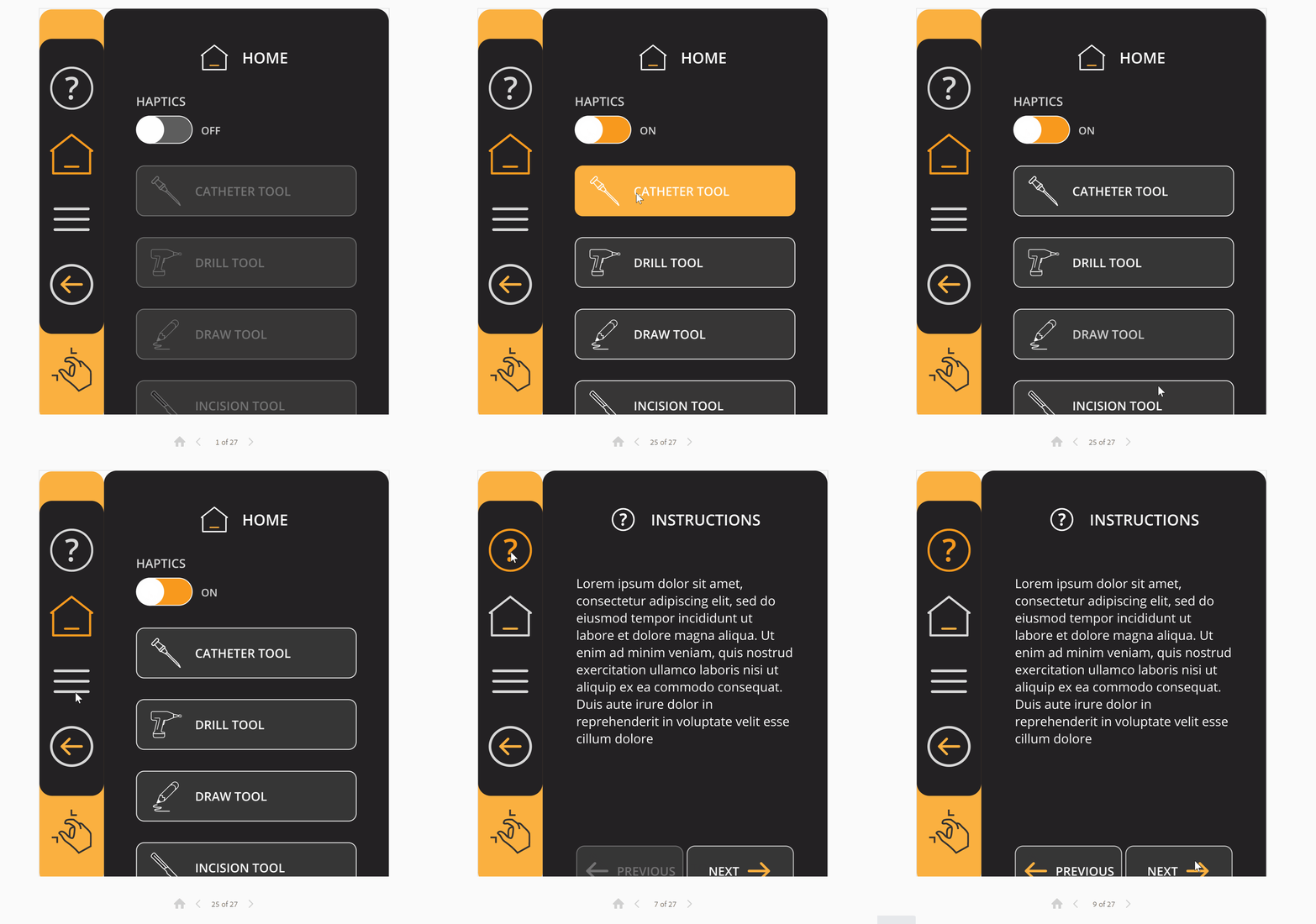
Each simulation started as a blank UI panel with every button randomly placed.
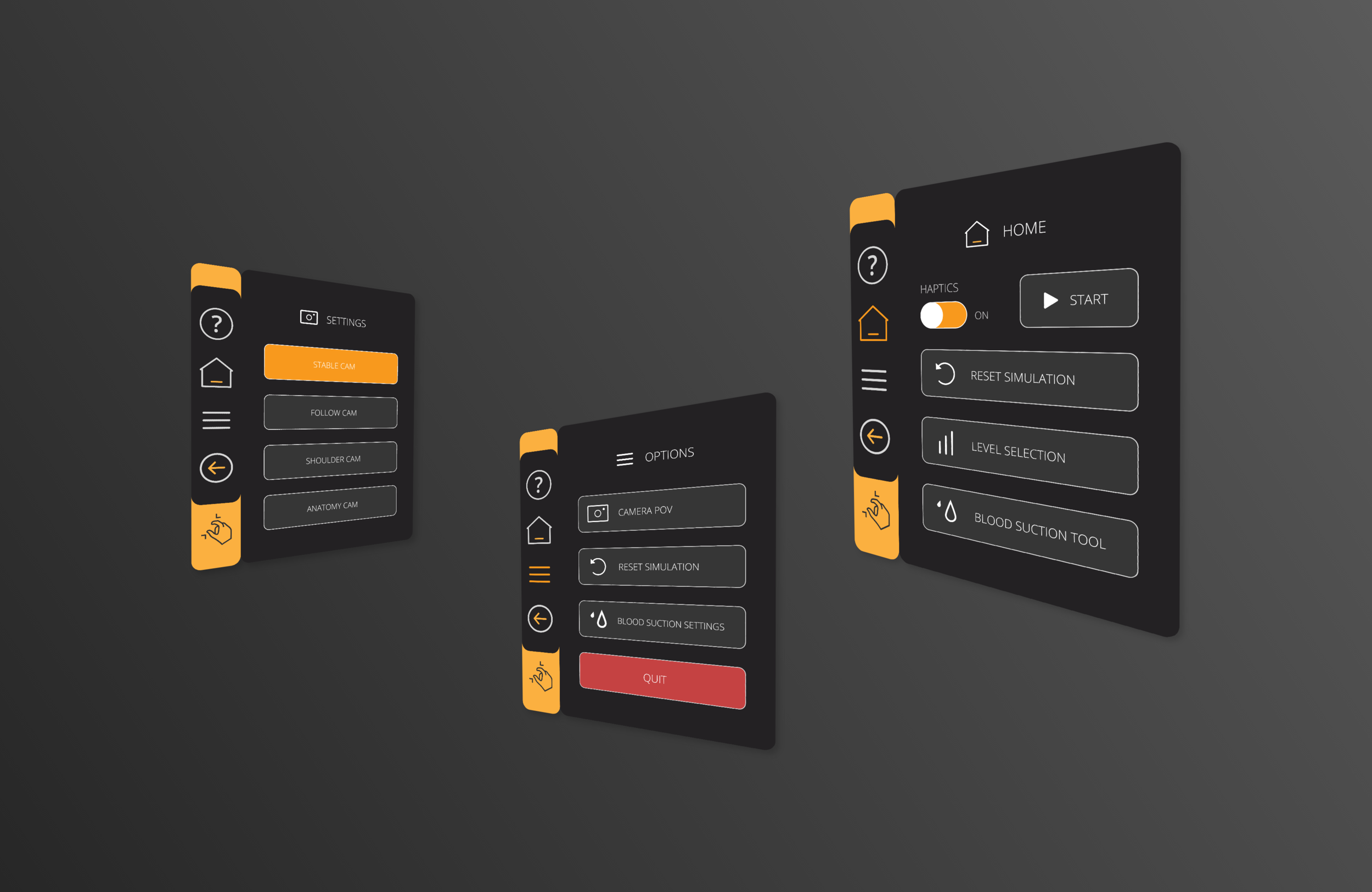
the final.
the process.
familiarize.
I needed to understand the goal of each simulation, and what tools and features needed to be provided on the UI.
I hopped on a Zoom, watched, and listened carefully as the head developer went through the simulations. Making sure I had a very clear understanding of each simulation before moving on to the next phase.
research.
I love researching and analyzing the market. What are some of our competitors doing? How do they present their tools? What graphic style is most common? What does their UI look like?
Because the timeline was so short there was no room for user testing or making large changes. I just had to work with what I could to create the best user experience possible.
wireframing.
I love using pencils and my sketchbook in this phase or using simple shapes to digitally organize features. Low-fidelity wireframes are super effective and provide the opportunity to explore many options and visualize thoughts quickly.
user flows + mock-ups.
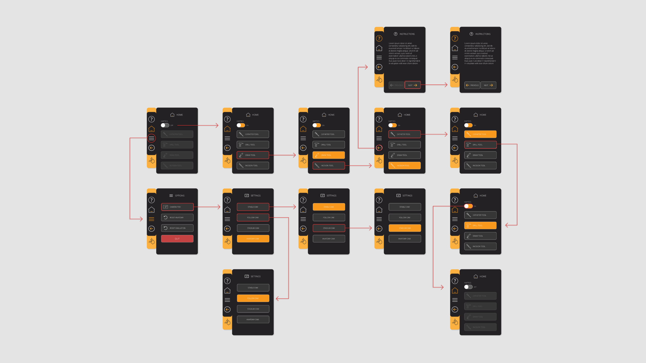
After I’ve mentally walked through the UI scenario by scenario, it’s time to visualize that flow and present it.
revisions.
If you don’t have revisions are you even designing? It’s important to thoroughly review the flows and mock-ups and make any updates before prototyping and developing.
prototyping.
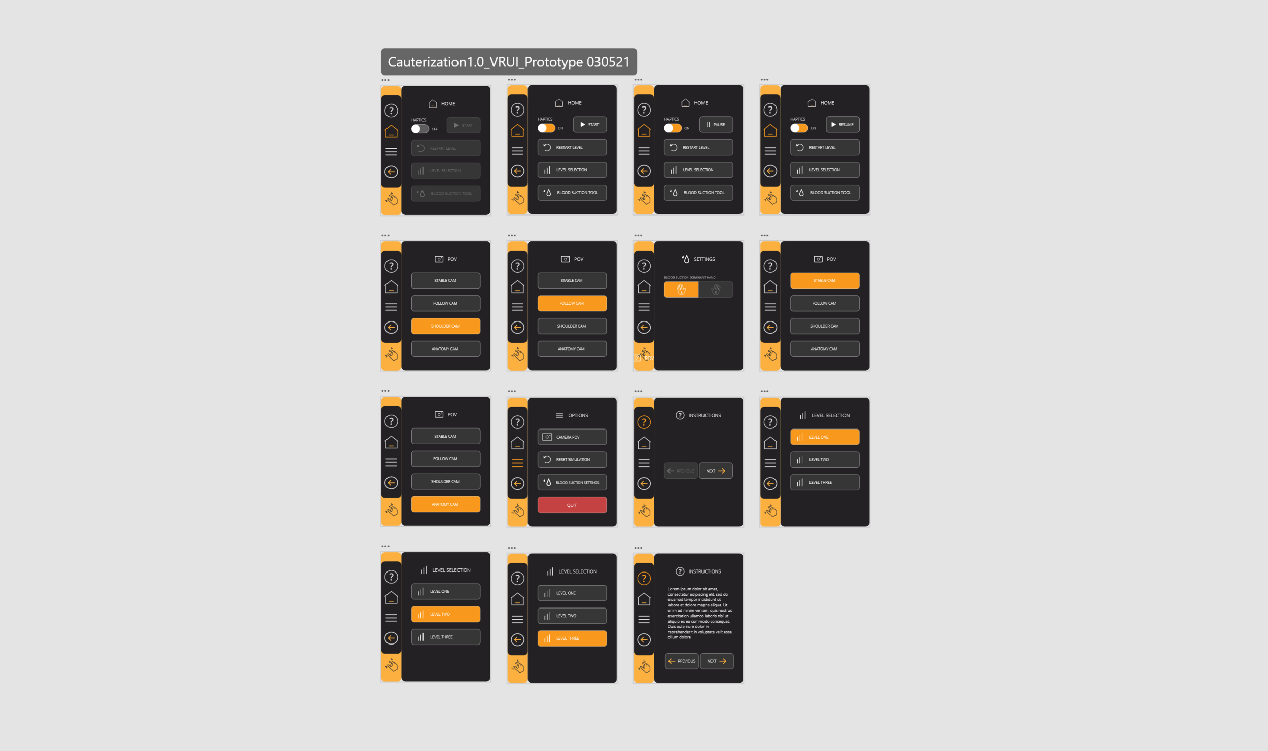
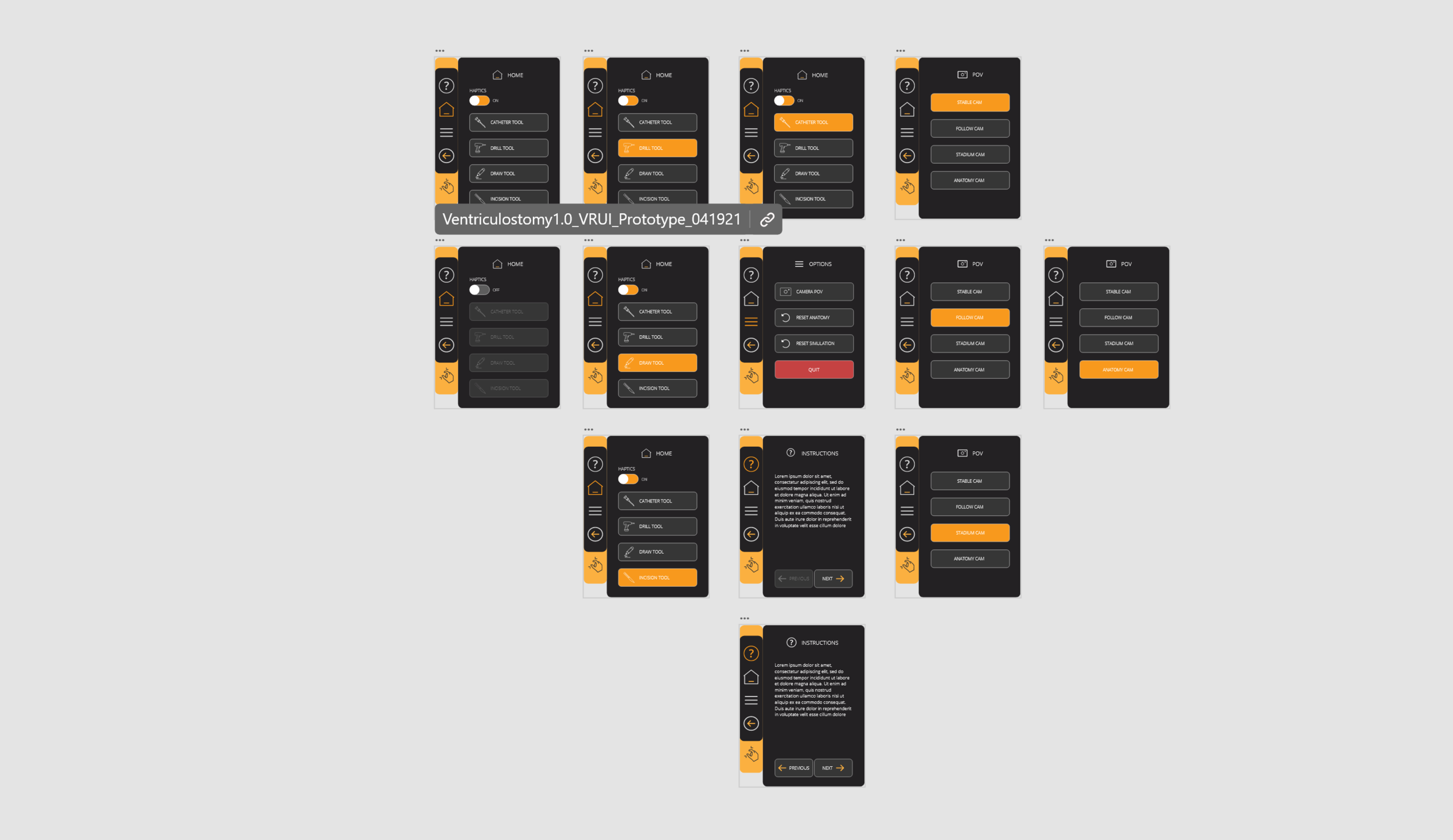
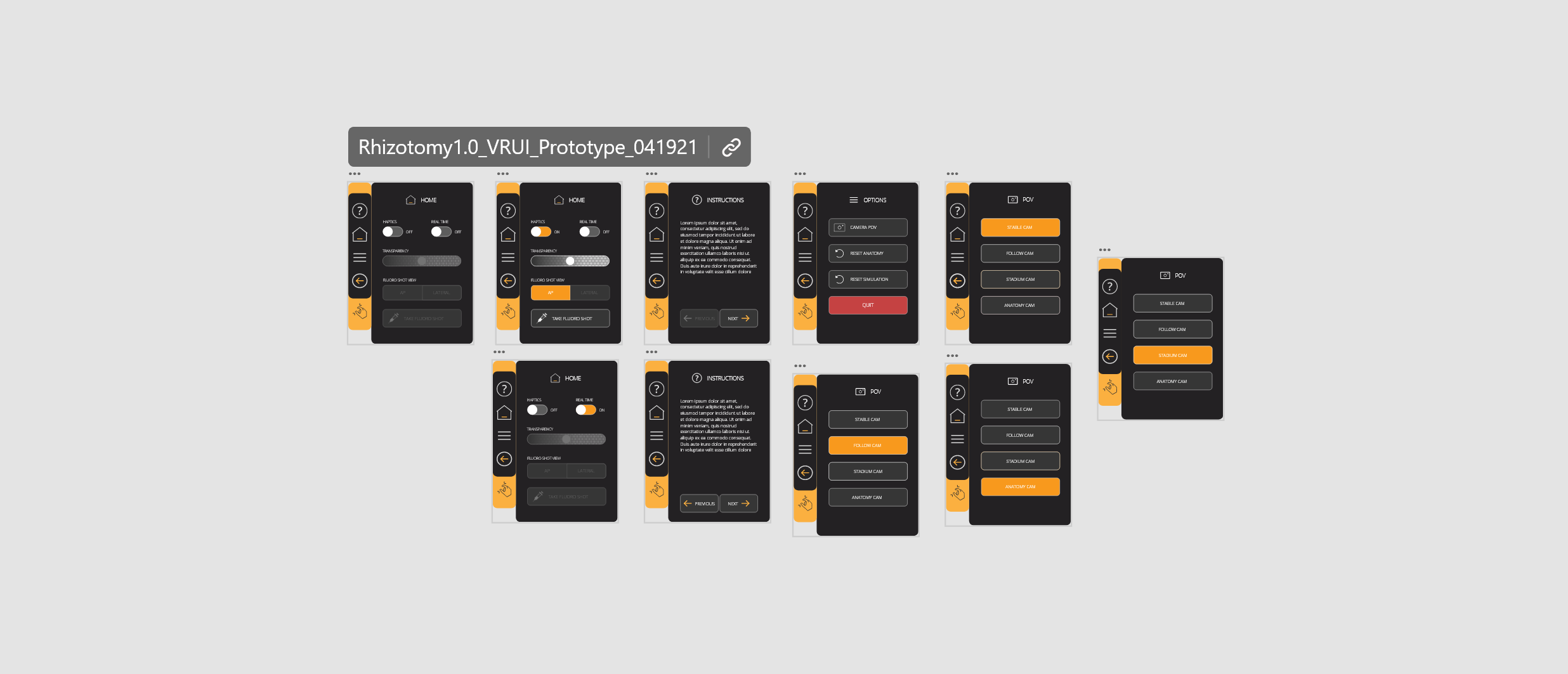
Prototypes are great for testing, but I also find they are great for developers. It can be tricky conveying designs and interactions to different departments, it’s important to choose a format that makes everyone’s jobs easier.
I also provide a developer’s version of the prototype so they can pull specific colors and sizes right off the prototype.
assets + design system.
The last step on our way to project completion is naming the assets, exporting them to hand off to the developers, and creating a digital library of components.


